The Brief
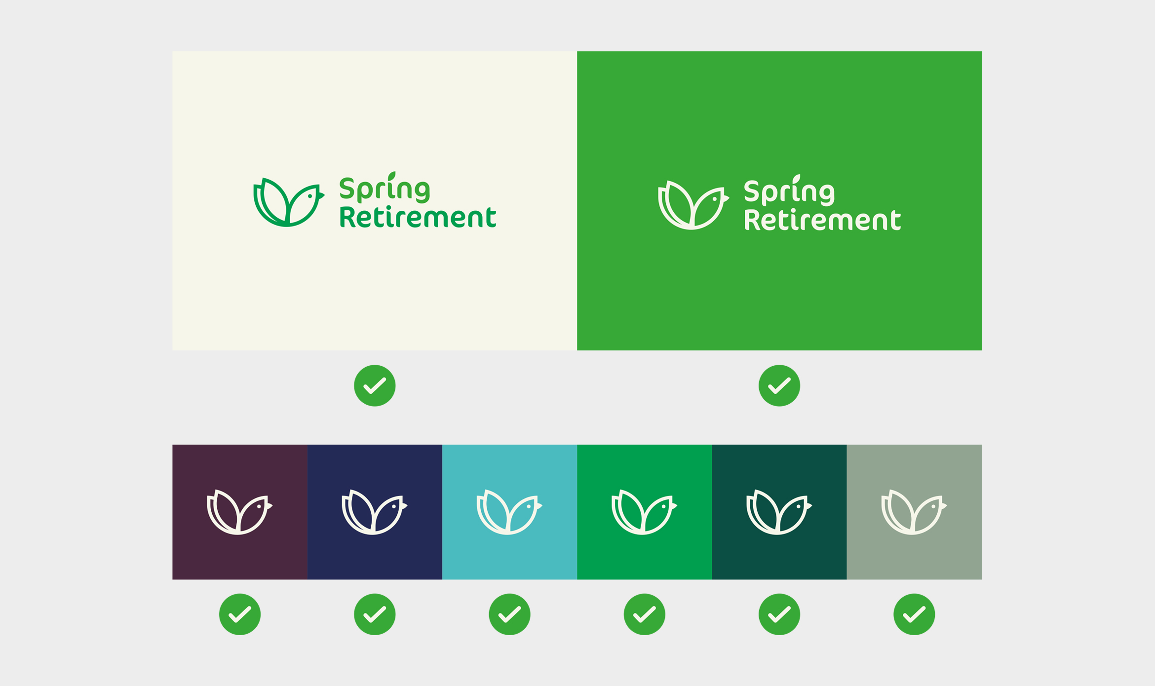
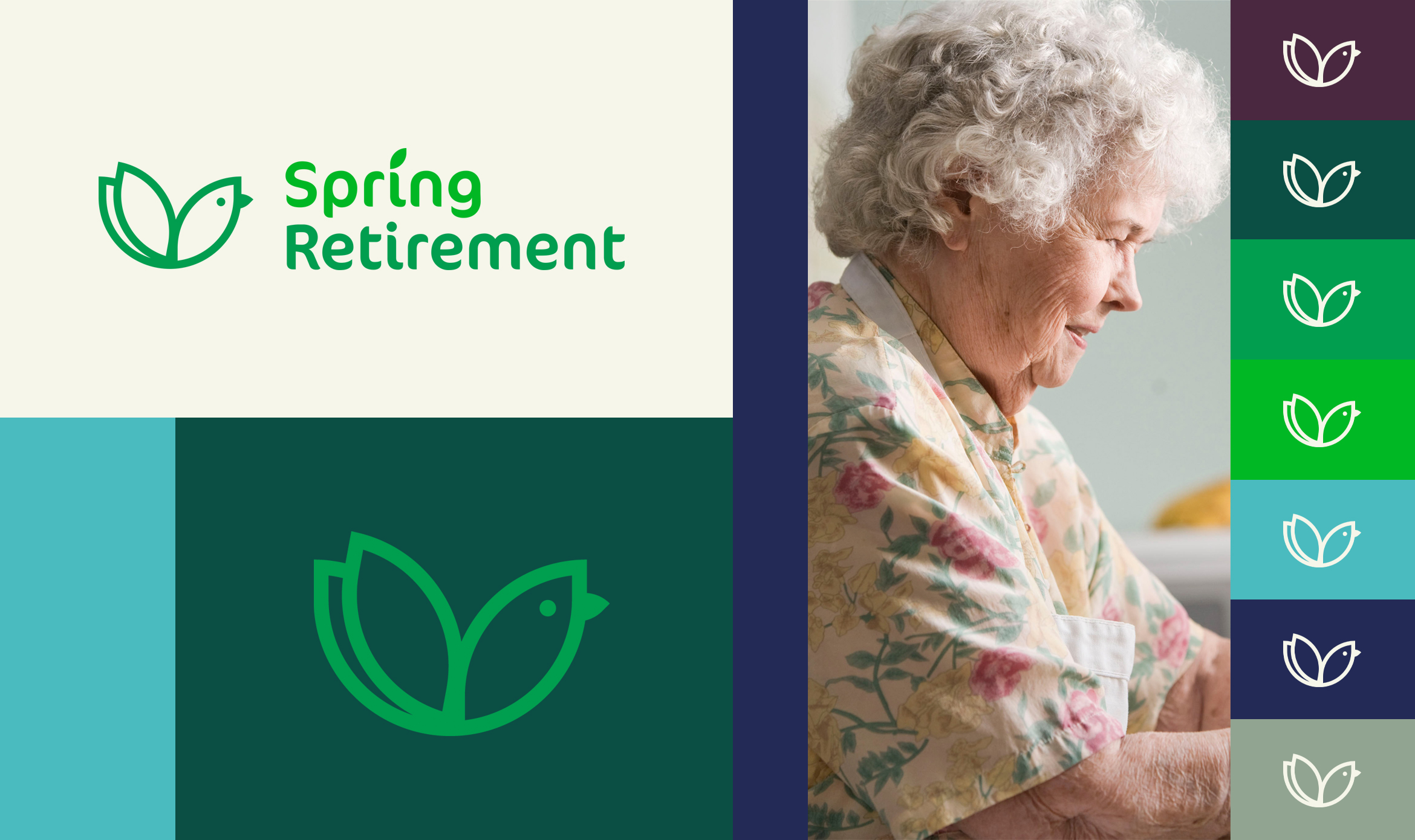
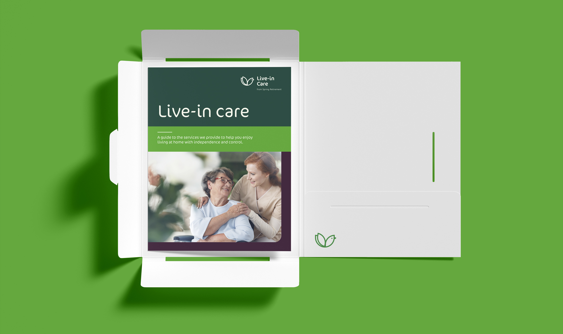
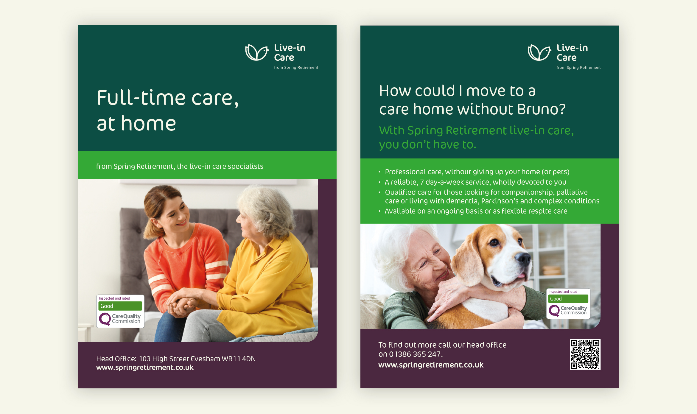
A new venture set up by clients who we had worked with at their previous business, our first task was to come up with a name which would be memorable and relevant to the nature of the client. A small team of incredibly committed, positive thinkers, we wanted something which would reflect their determination to make their care for their clients a new start to a good phase of their life. We found that professionals and patients alike enjoyed the Spring Retirement name, offering a contrast to the usual talk of the autumn of life and that it does a great job of introducing a team devoted to, as we phrased it in their value proposition, helping their clients to enjoy life more. Beyond the name, we were also asked to design the identity, a simple website and all communications.
What we did
- Brand and Creative Strategy
- Branding & Identity
- Copywriting
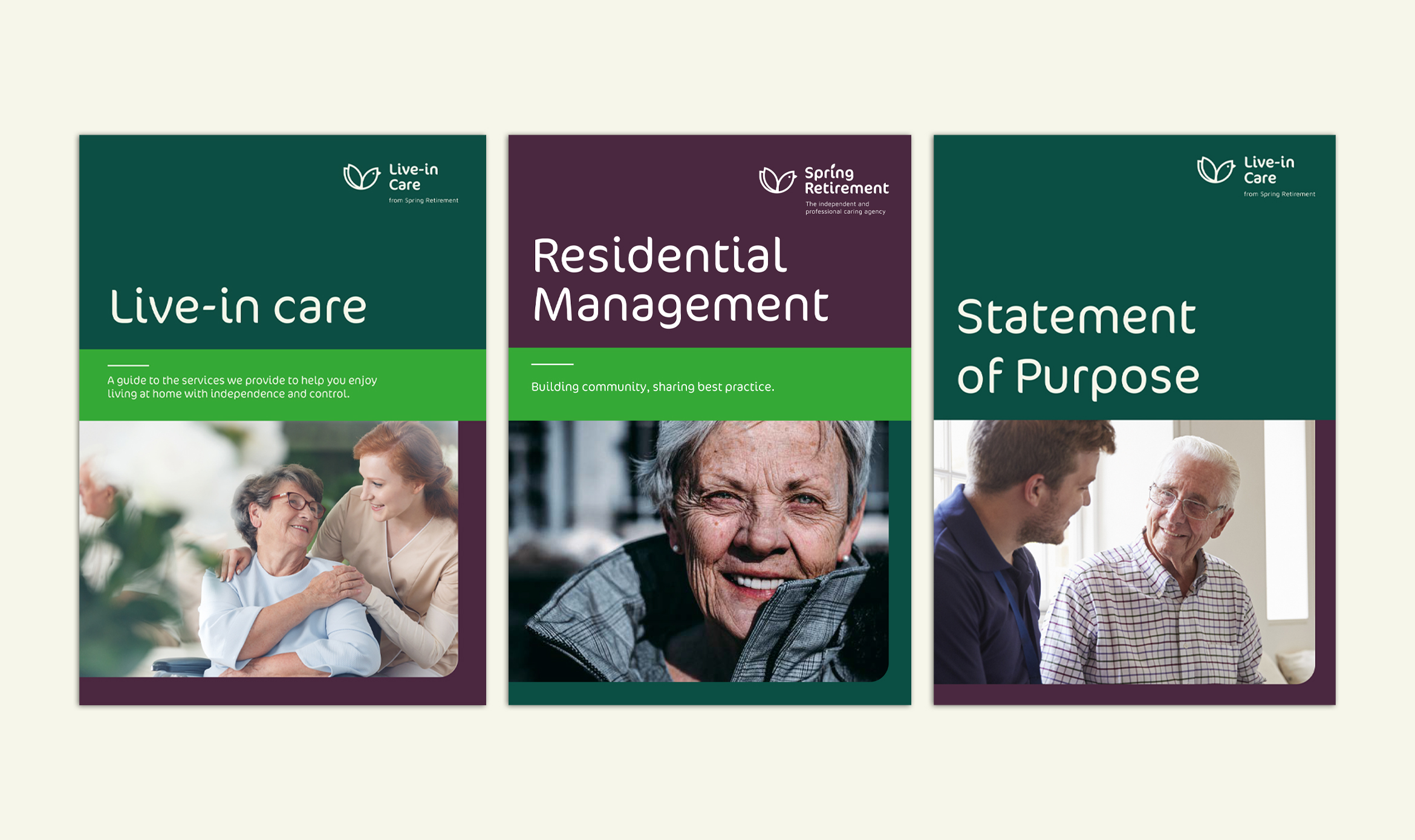
- Literature
- Logo Design
- Naming
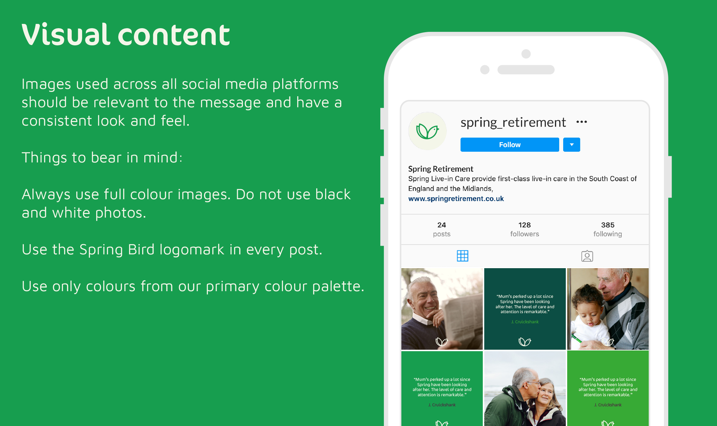
- Website Design