The Brief
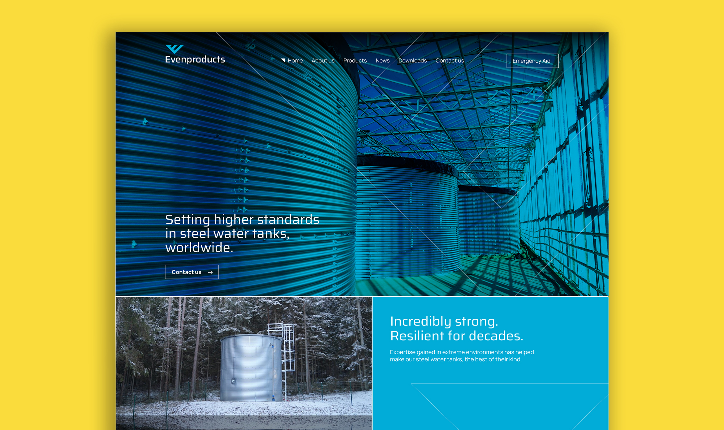
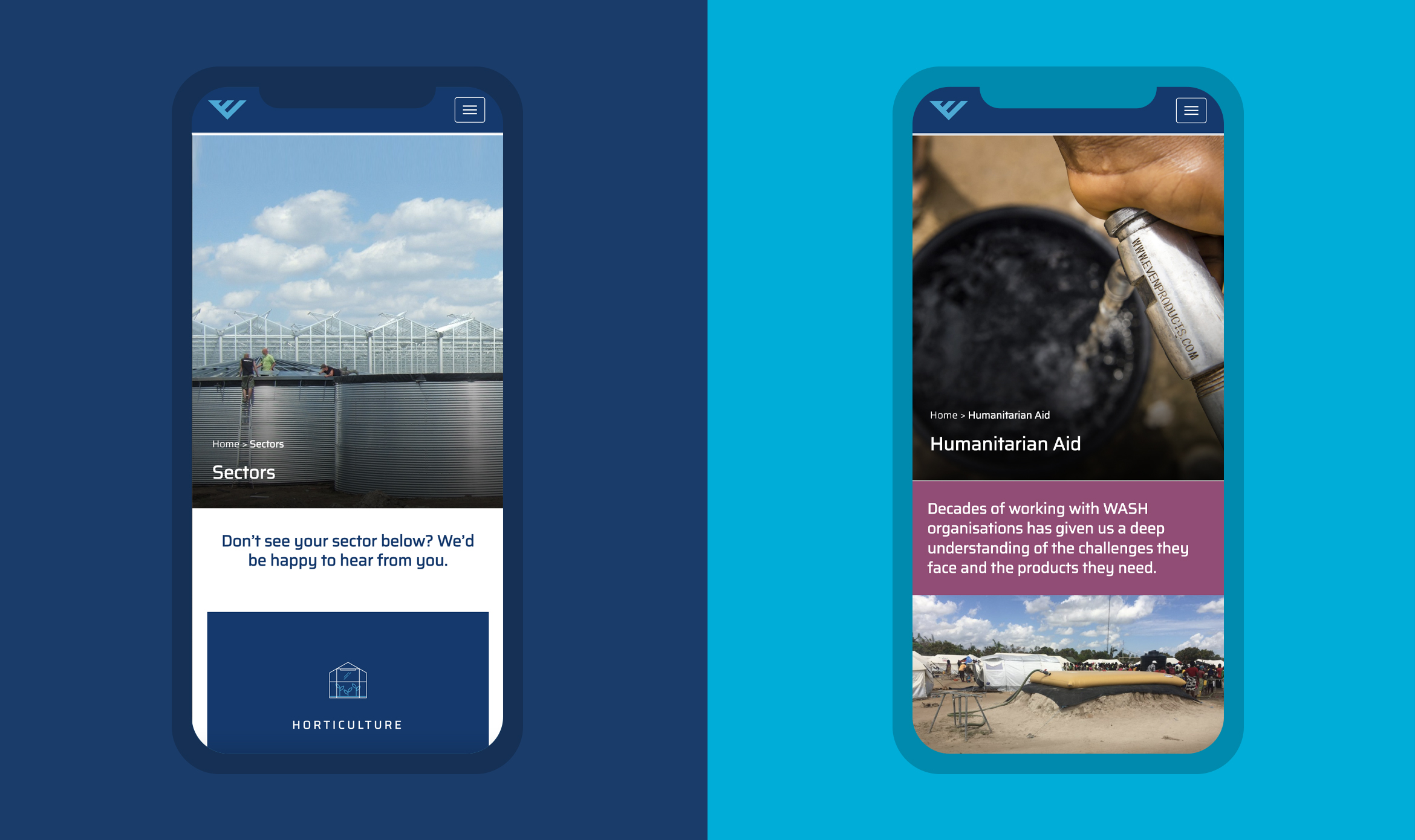
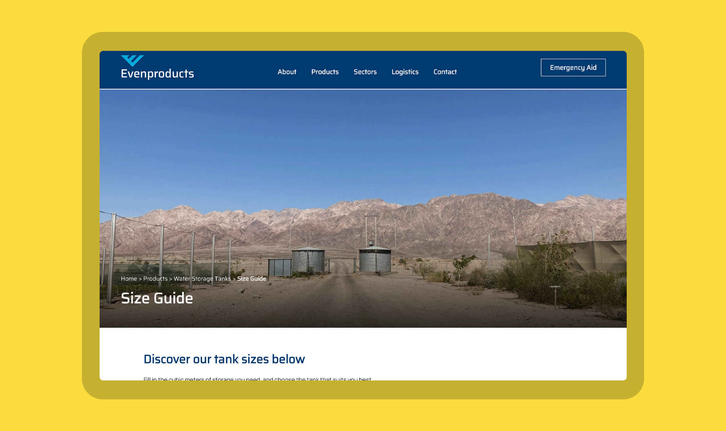
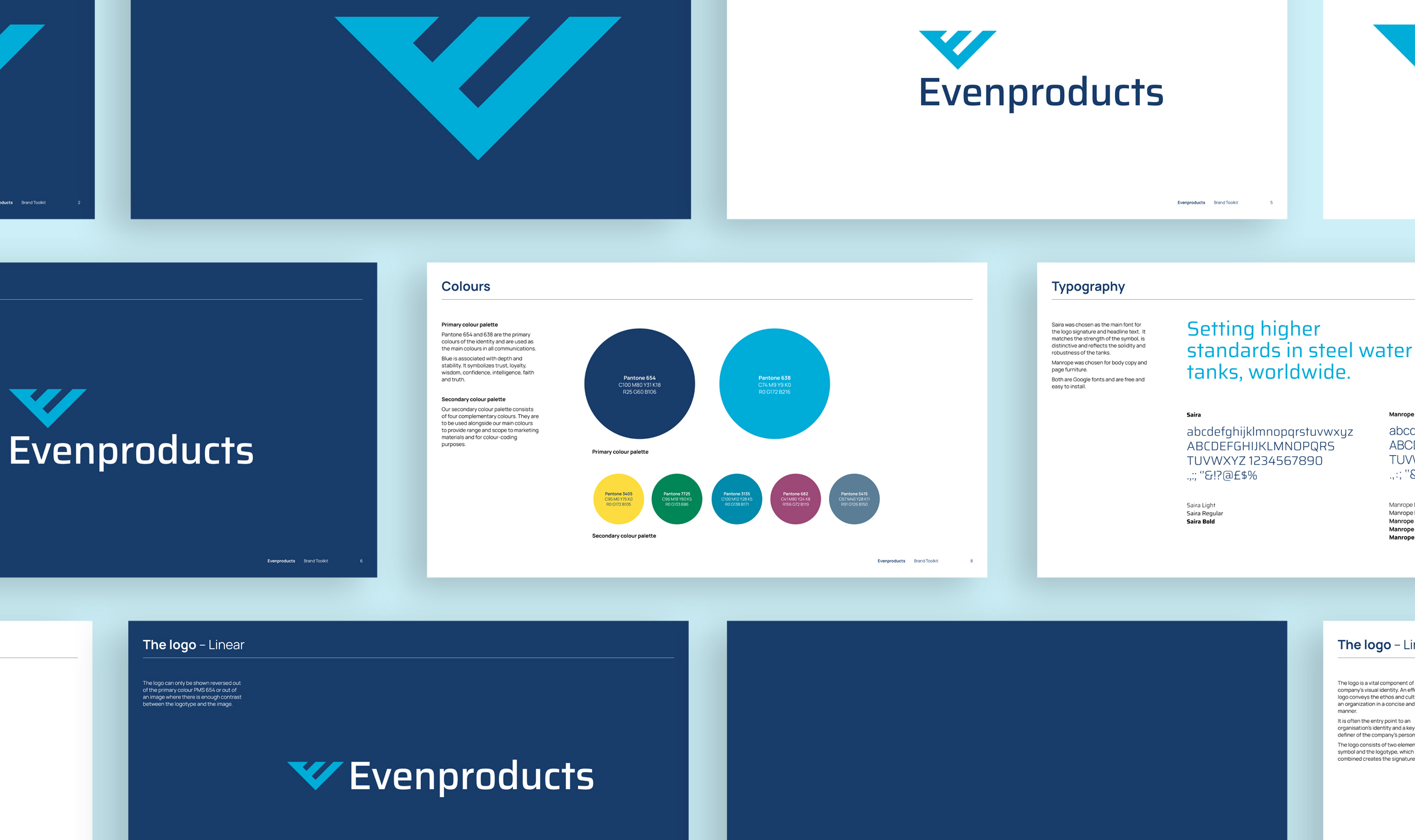
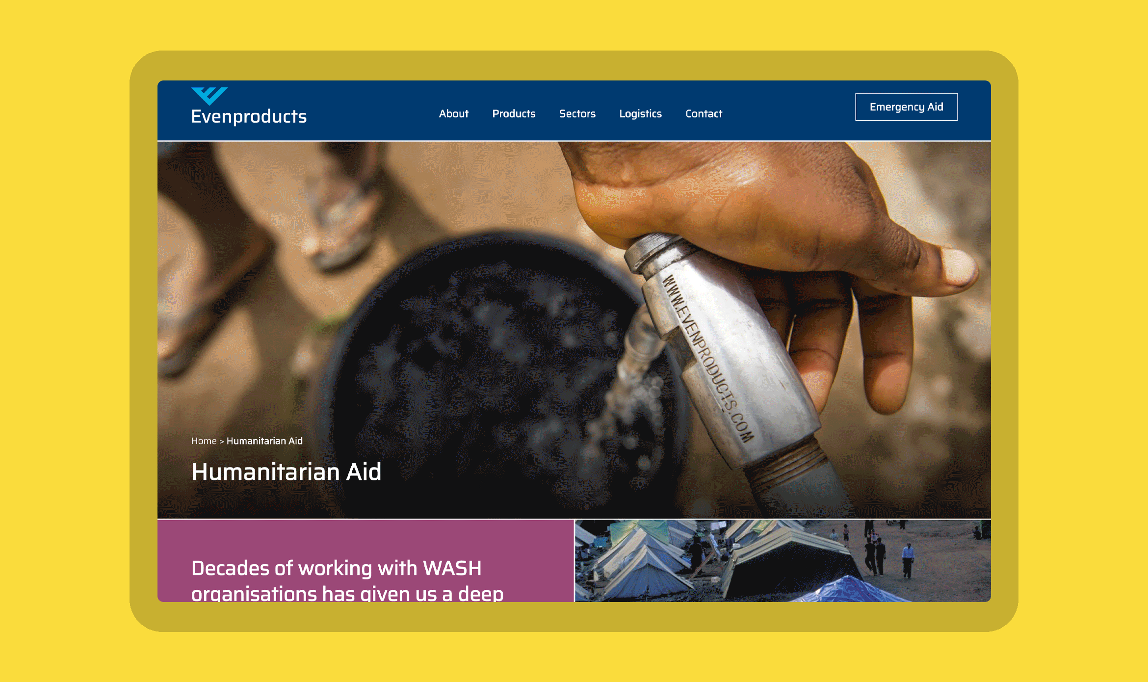
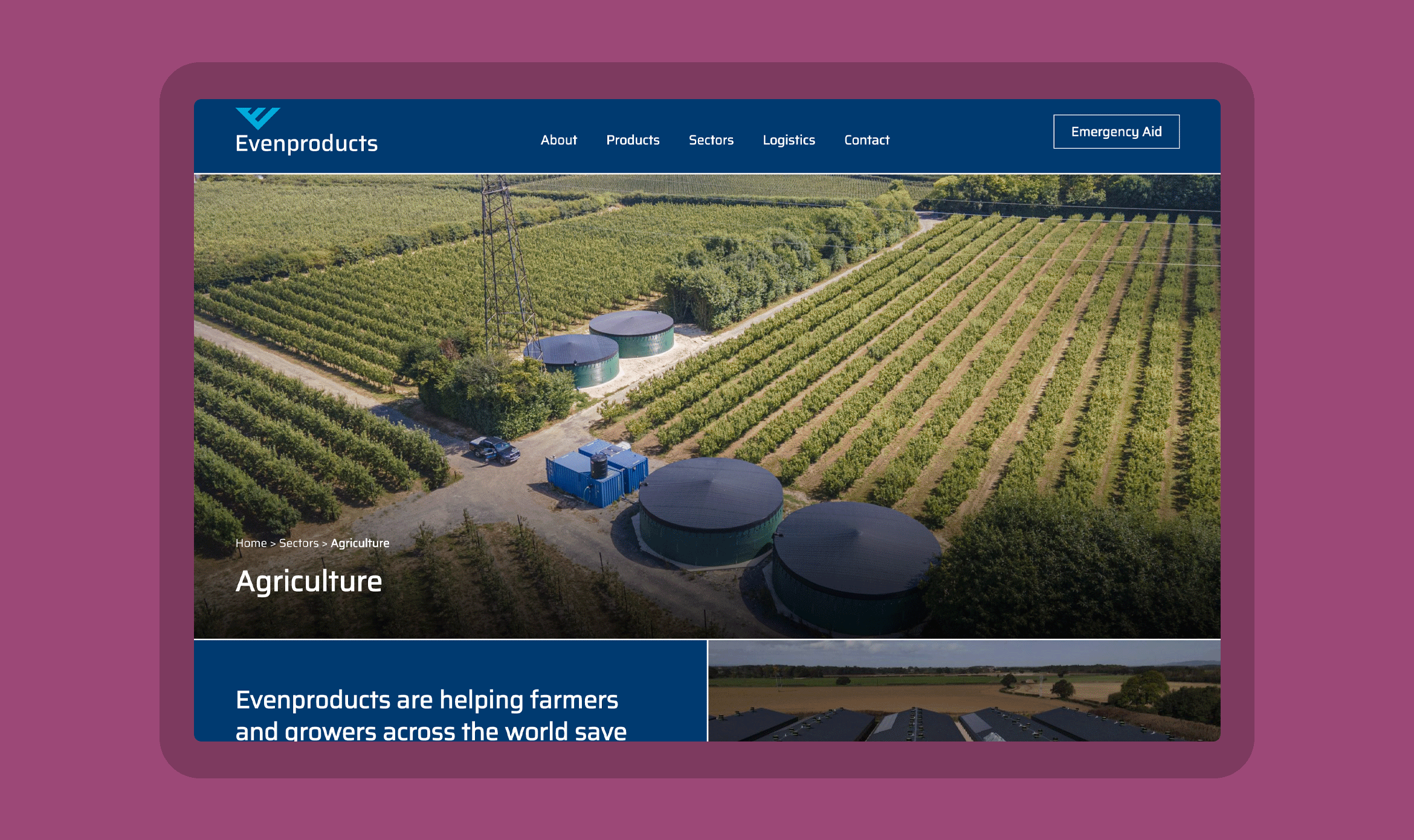
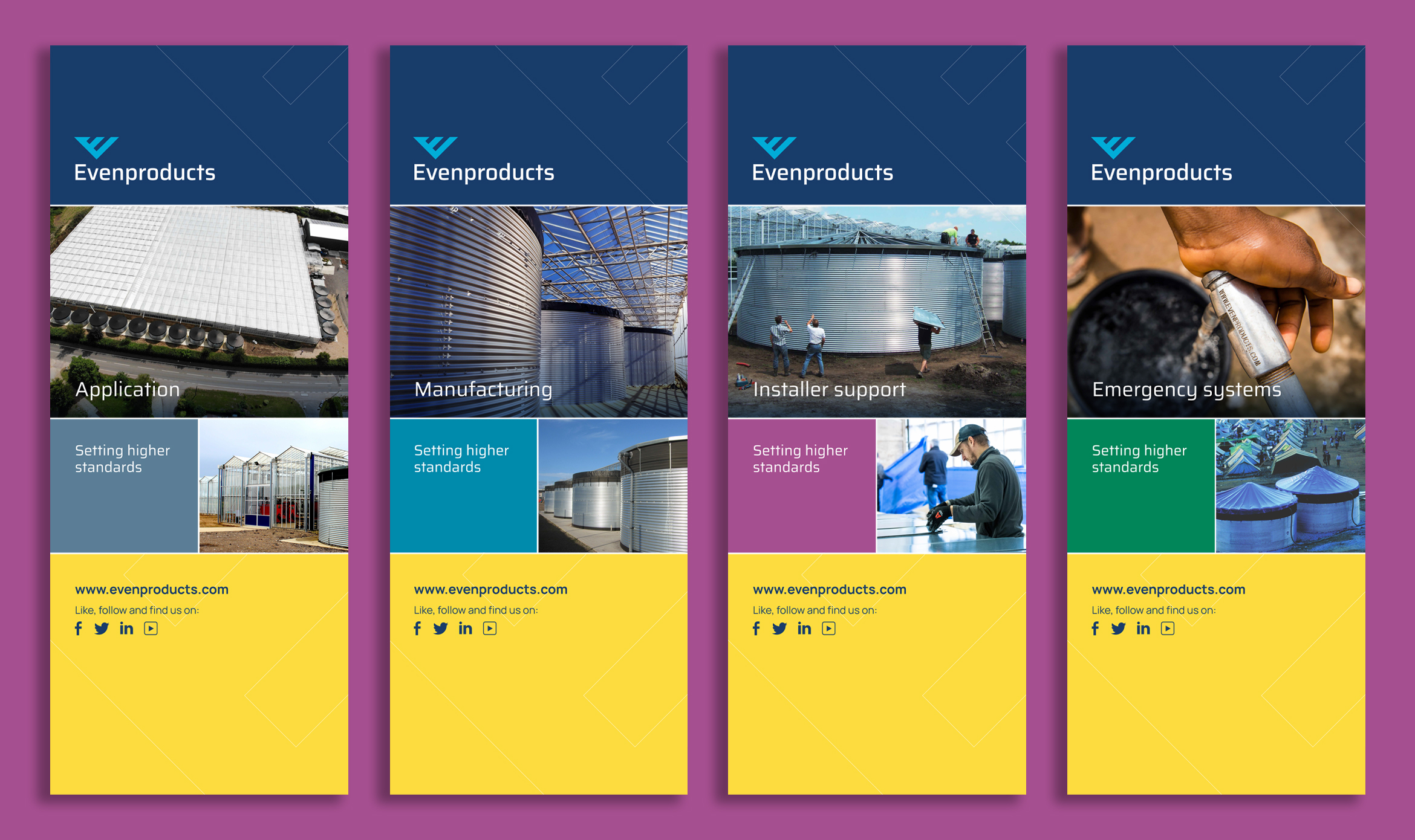
Evenproducts makes incredibly useful products (steel water tanks), incredibly well. They first hired us in 2016, at which point they had about 70% of the UK market and wanted to expand their overseas sales, especially to emergency aid charities and NGOs. We tidied up their existing identity (which was OK if overly modest in a way that is typical of British SMEs) and created a new website which emphasised their emergency aid credentials. Their plan worked. Over the last six years, Evenproducts has increased sales to the aid market to the point at which it has gone about as far as it can. It has also refined its production and management processes to an international standard. Evenproducts came back to us this year, keen to assert a much more corporate, ambitious ethos, ready to take on the biggest international markets in horticulture, sports clubs and more. They needed a new identity, website and exhibition materials. Our solution takes a route which is bolder, simpler and has much more gravitas, whilst still echoing the former identity and the brilliant business it represented.
What we did
- Brand and Creative Strategy
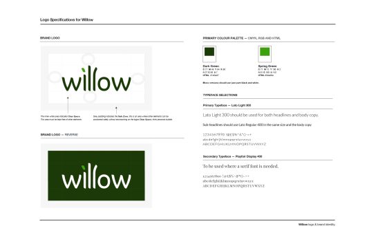
- Branding & Identity
- Copywriting
- Design
- Illustration
- Information Architecture
- Literature
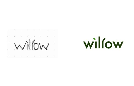
- Logo Design
- Tone of voice
- UX
- Value Propositions
- Website Build
- Website Design
- Wireframes + Sitemaps