The Brief
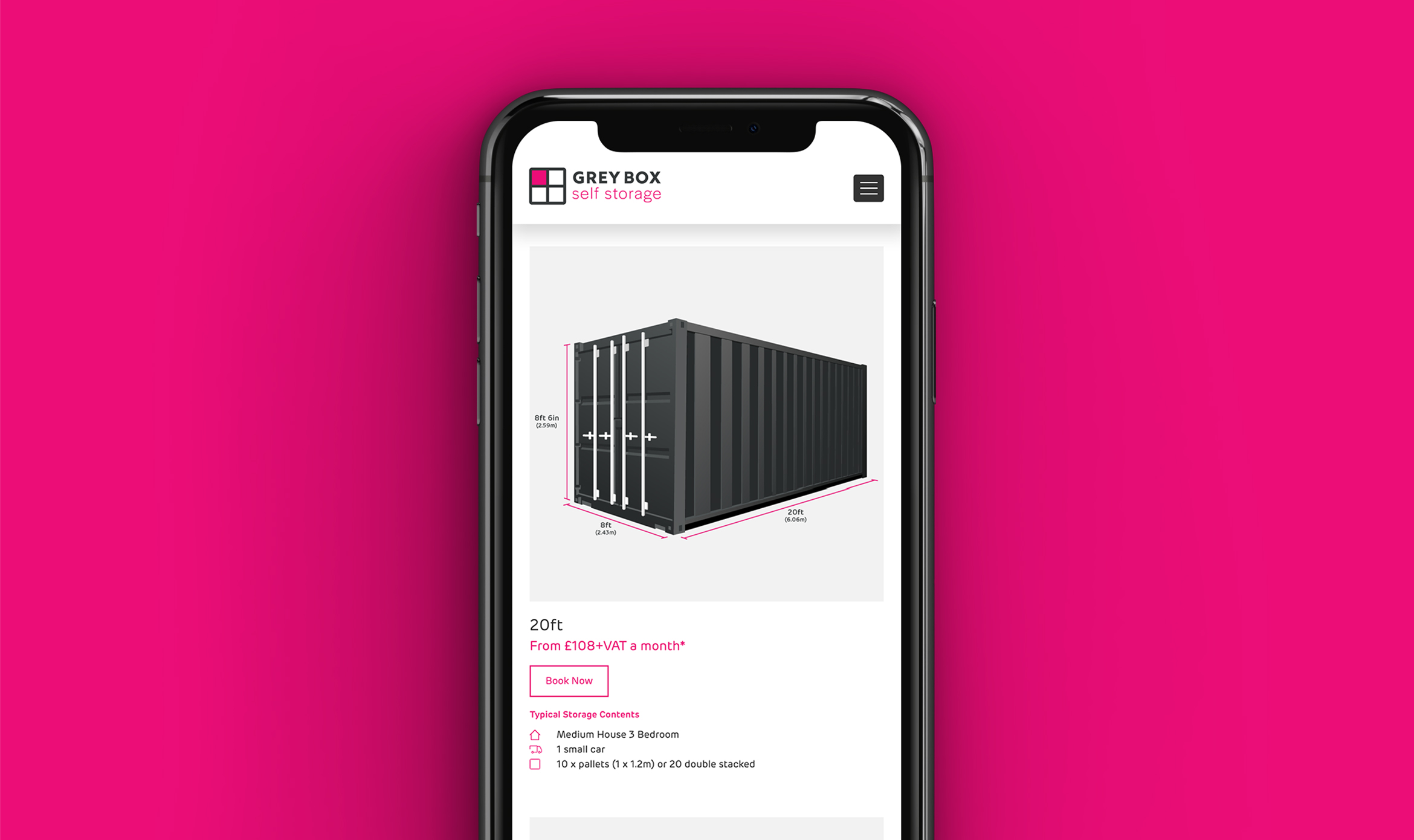
Grey Box Self Storage approached Real Branding with a challenge to develop a strong identity and a website that would have immediate, memorable appeal to their target audience. To achieve the stand-out engagement required in a competitive sector, the site must follow through that appeal with easy, intuitive navigation, including specific storage unit selection, sign-up and payment.
What we did
- Branding & Identity
- Creative concept
- Design
- Logo Design
- Tone of voice
- UX
- Website Build
- Website Design
- Website Design
- Wireframes + Sitemaps
Client Background:
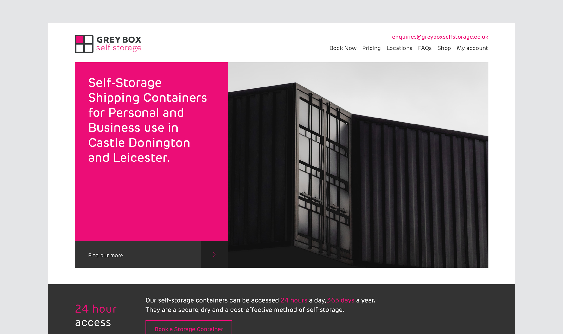
Grey Box is a self-storage provider based in Leicester. The company offers storage solutions for personal and business use. Since its establishment, Grey Box Self Storage has added a second facility, in Castle Donnington, with more planned.
Strategy and foundation design work:
We conducted extensive research on the self-storage industry, refining our understanding of the target audience. We then developed a branding strategy which took into account both that audience and the client business plan (especially in relation to scaling up).
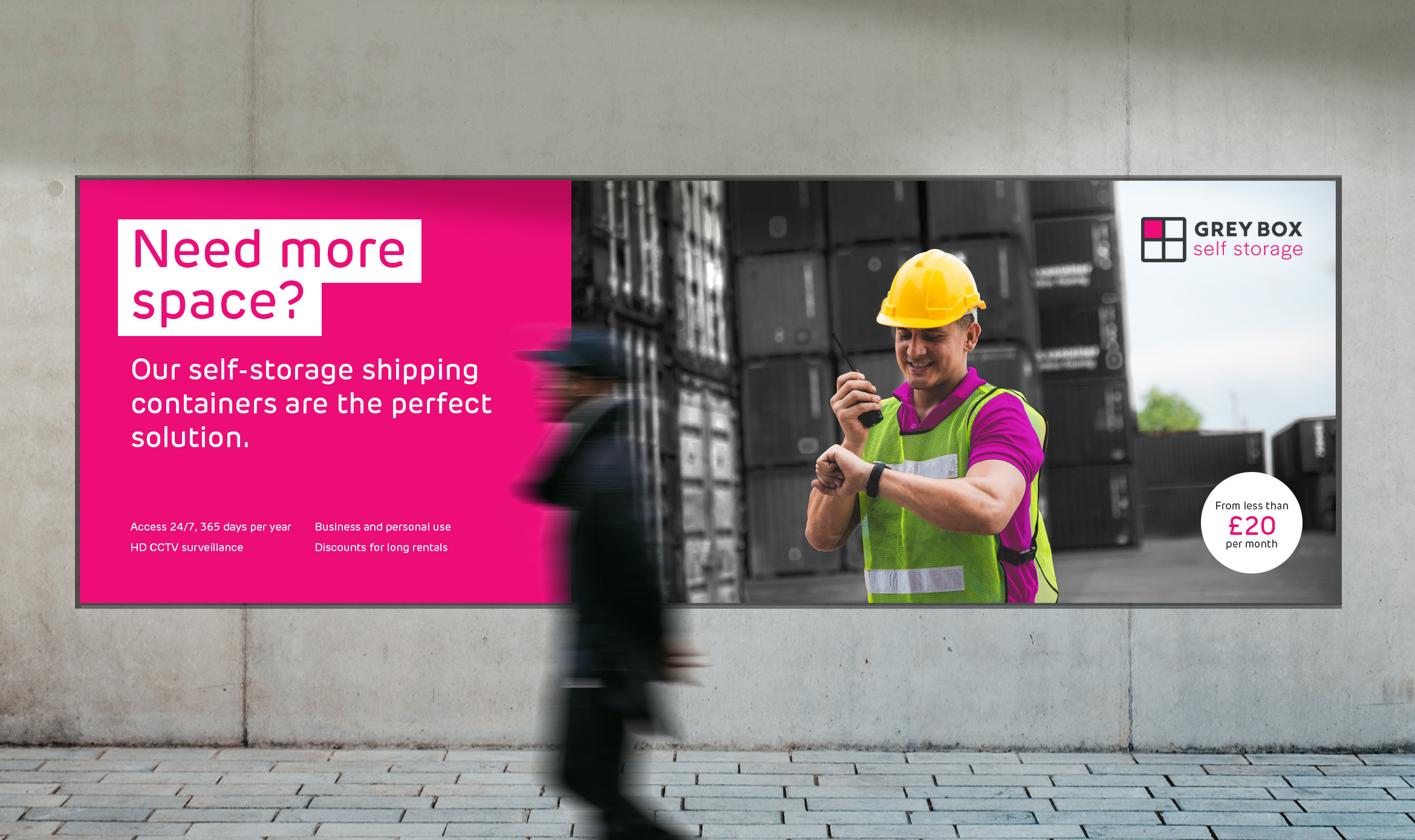
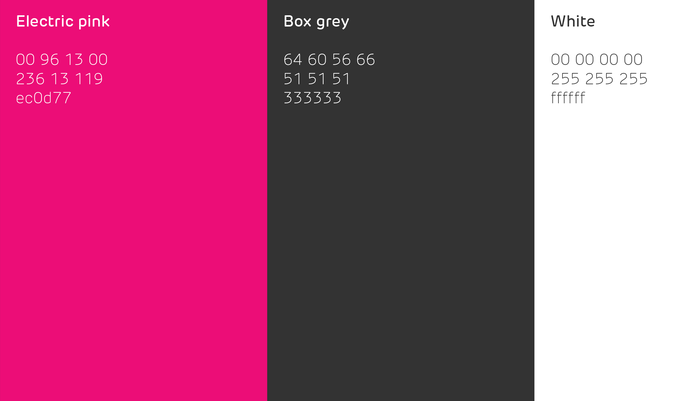
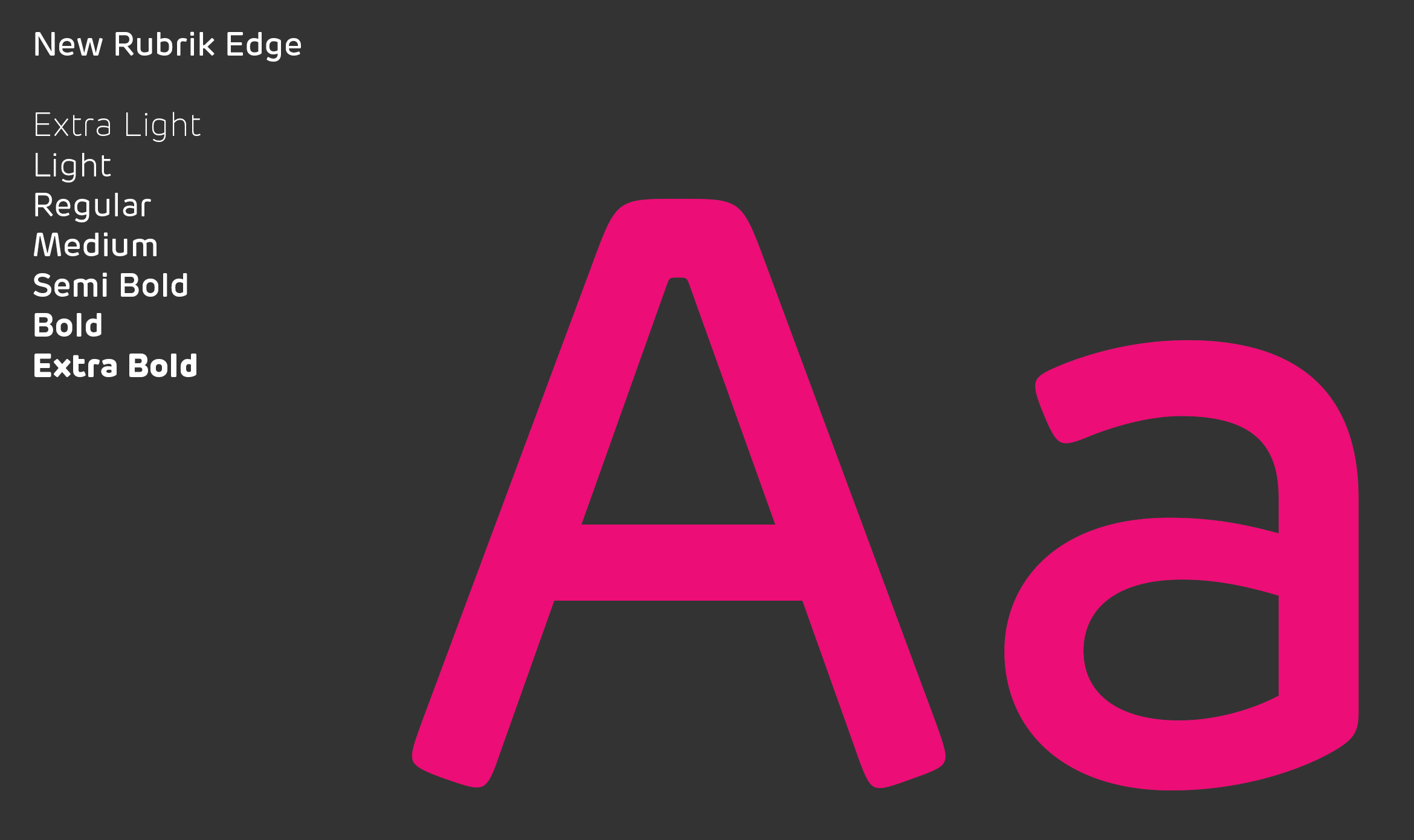
Opting for a ‘no nonsense’, relatively masculine tone, we explored logo designs that we simple and modern. As the favoured treatment emerges and we moved onto colours, we settled on a pink to both complement the various shades of grey and introduce a touch of femininity and sophistication to a look which otherwise risked being too dark. These we matched with a modern font which is distinctive, without being distractingly so.
The result commands attention and suggests strength and reliability, whilst feeling approachable and professional.
Website Design and Build:
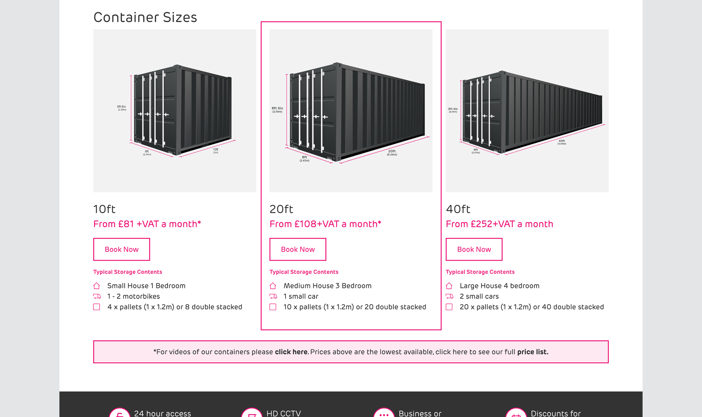
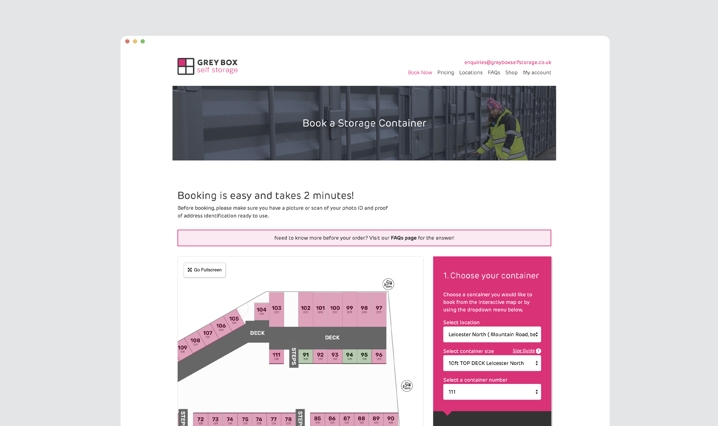
The client being familiar with the WordPress CMS, we created a custom WordPress website that was both user-friendly and aesthetically pleasing. It includes a multi-step booking form, where customers select the location and the size of the unit they require and then book it at either full or discounted rates, depending upon how many months the pay for, in advance.
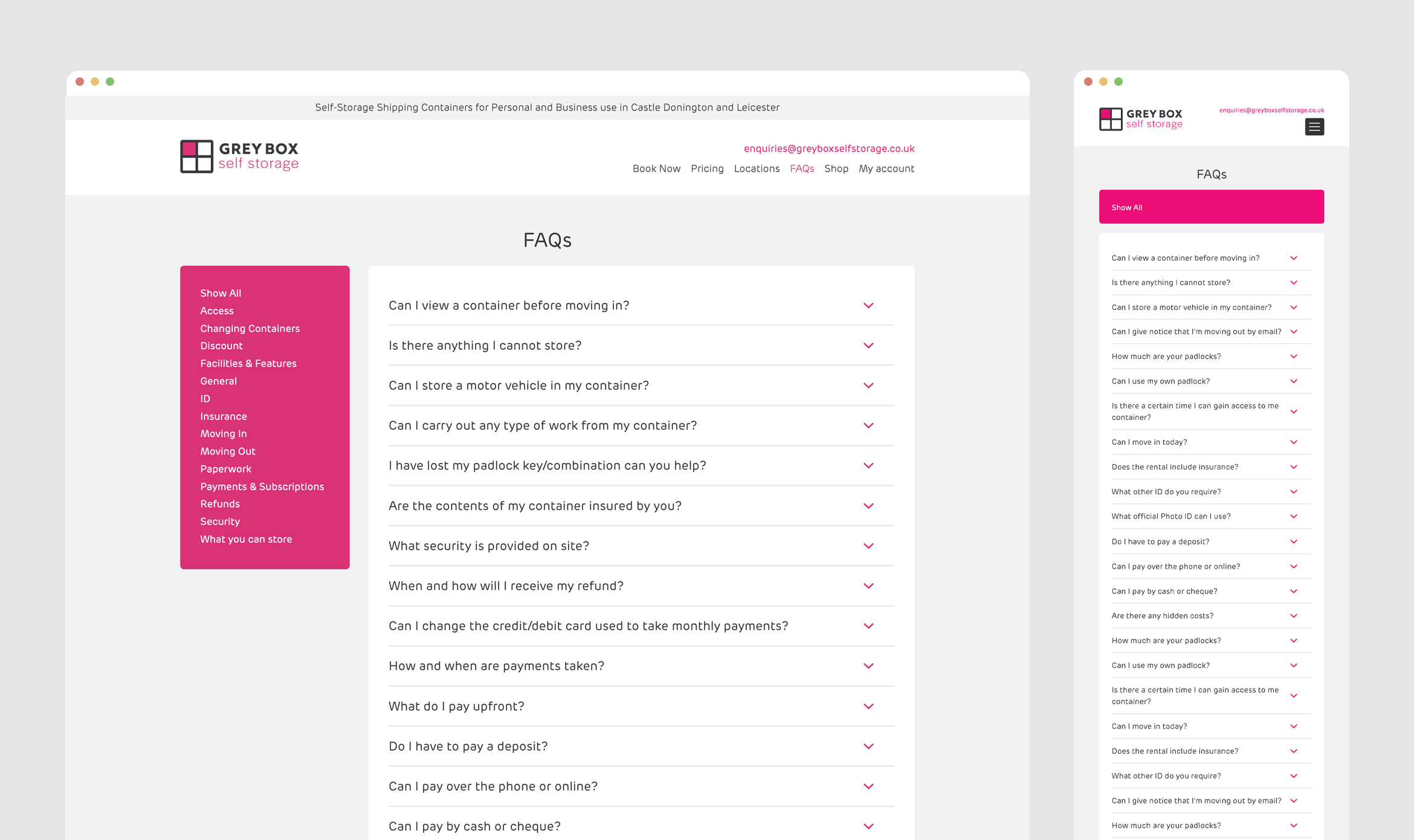
We also created an online shop where customers purchase locks, vehicle ramps and electrical sockets – ie everything they might want for their storage unit. Alongside, an FAQ page makes it easy for them to find any other information they might need.
Results:
The new branding and website design for Grey Box Self Storage successfully positioned the brand as a modern, reliable, and professional self-storage provider. All functions have worked well from the start, driving very high levels of engagement and conversions.
Both sites are fully occupied with an active waiting list of new would-be customers. The company has achieved its aim of having a website which gives it a near-entirely automated process and establishes new standards of user-friendliness in this highly competitive market. This has placed them in a tremendously confident position as they look for new sites.
