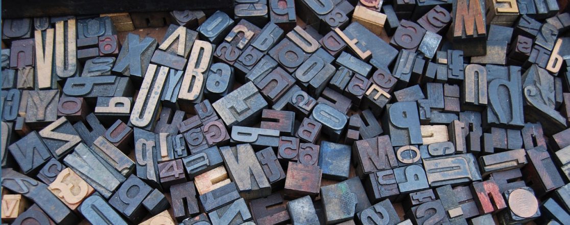
So many designers today opt for the easy, safe option for both web design and online typography, resulting in digital brands looking the same. You don’t have to lose your distinctive edge when you broadcast your brand online, instead you should embrace the flexible medium. Changing proportions and styles on different devices should evoke interest among users not standard template grids and overused fonts. We like to change digital design with every project to make you stand out, whether that be in bespoke layouts or characteristic fonts.

UK Market Review Website
Before the days where there were only a few web save fonts and all your competitors used either Helvetica, Arial or Times New Roman meant that to be distinctive and stand out you had to use some outrageous and none supported web font to get noticed. Which after all, only lead to an unpleasing response. However, now that isn’t the case, there are many more web safe fonts available for designers to use and not to be afraid of using. Even if your corporate font isn’t web safe, there will be a close alternative (which your audience probably won’t notice a difference) available which doesn’t mean you have to use the standard Helvetica typeface, which doesn’t match your brand.
For an example, Gotham (Rounded) is a such loved font among designers, however it isn’t web safe. This frustration can cause designers not to use the typeface within their brand, although ‘Varela Round’ is extremely similar. It might seem odd to have two different fonts for two different media, however is justified if a lot of material is produced in print using the preferred characteristics of the print font.

Ken Bell Accounting Website
The Ken Bell Accounting site is an example of this it uses both Gotham Rounded in the logo and Varela Round for the website.
There are many libraries online displaying web safe fonts, some more trusted than others. Some are free to download and others you have to purchase. The main ones I tend to use are: fonts.google.com, fontsquirrel.com, typewolf.com and myfonts.com
I tend to favour and like different web safe fonts on a constant basis which means it keeps my work and designs fresh and different from project to project. A few classic fonts I have as a go-to typeface are:
- Roboto: Simple, clean and great for technology brands
- Source Sans Pro: complimented with Source Sans Serif, Elegant serif font contrasted with a easy to read san-serif font
At the moment a few web safe fonts I like are (not necessarily new):
- Montserrat: Very bold, simple and squat
- Unbuntu: Distinctive elements make it stand out

