As has often been pointed out, some of our most everyday conveniences were invented not for mainstream use, but for specific minorities. Electric toothbrushes, ‘soft grip’ potato peelers and voice-to-text software, were all solutions for people with specific disabilities. These inventions subsequently went mainstream because they made life easier, for everyone. Indeed, Netflix have recently revealed that 40% of all global users (not just the hard of hearing) have subtitles turned on, all the time, with even higher usage amongst 18 – 25 year olds. Why? Because it’s easier. As one interviewee said “In some shows, there is so much going on, it helps me to not miss the details”. Yet there is a reason that Netflix only offered subtitles to all, years after the software was originally developed.
Accessible design costs, especially when it’s new
It’s the same reason that one of the first typewriters was invented in 1808 for a blind Italian countess who could no longer write letters by hand. She was a countess: she could pay.
Not only is developing new products excruciatingly expensive, the early versions are rarely all that good. It takes time and money for them to reach the point at which they are so good, and so cheap, that everyone wants them and can afford them.
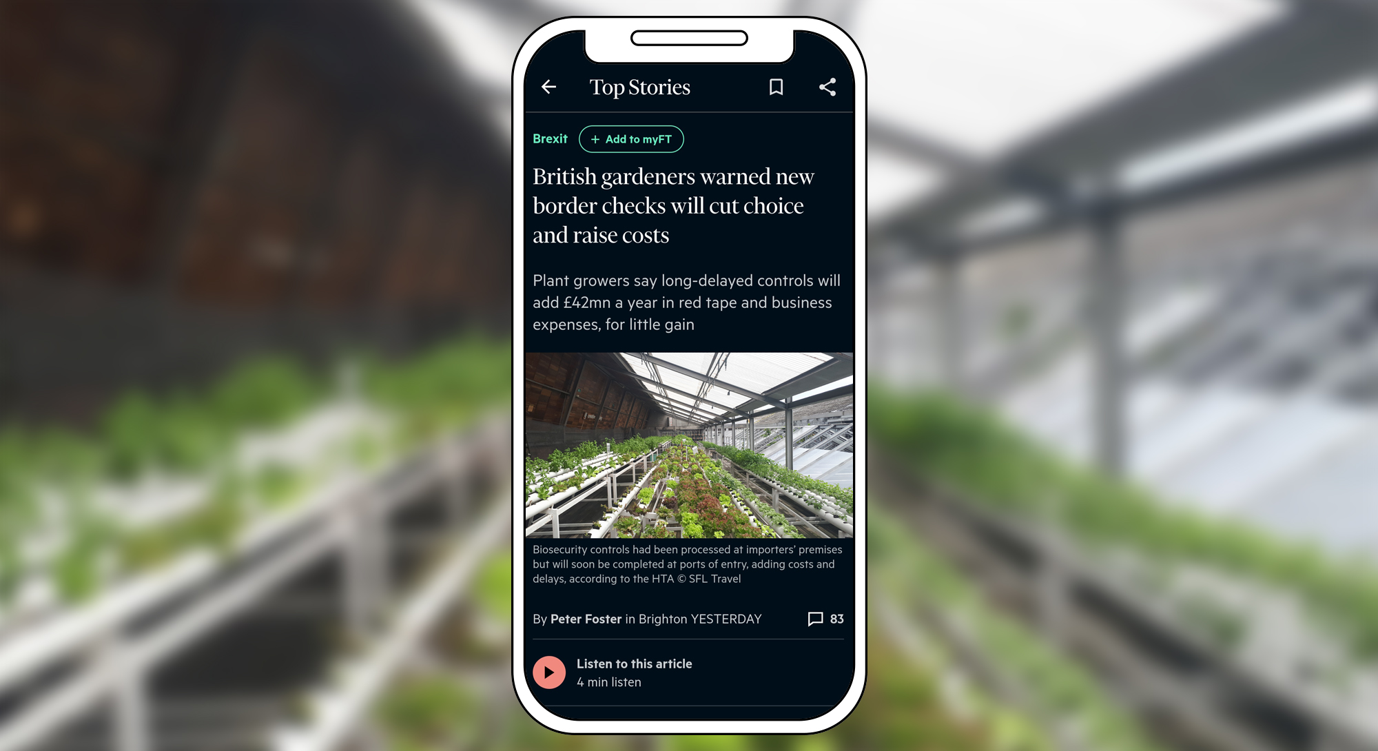
Best practice website design has followed a similar path. Features such as image descriptions, mouse-less navigation, e-reader prompts, subtitles and transcripts of audio content, can now be incorporated very inexpensively and are often used by non-disabled users. FT app users, for example, can listen to all its articles, whilst doing other tasks such as driving or housework.
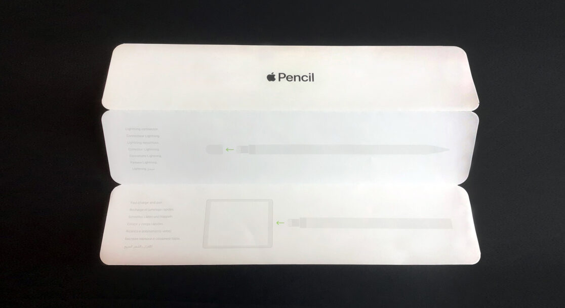
Better still, in relation to graphics, text and navigation, accessible design really is good design. The Apple pencil instructions above, provide an example of what NOT to do. They might look slick but they are just too hard to see. In contrast, a website which works well, say, in poor light (too much or too little) makes life easier for people with perfect eyesight, as well as without it. Similarly, clear navigation, colour-coded function buttons, breadcrumbs and intuitive structures might be essential for those living with dementia and neural diversity – but they also make browsing a website much more enjoyable, for everyone else.
It is features that go beyond these basics, which pose dilemmas for businesses commissioning a new website. This is partly because of their up-front cost, but mostly because they demand on-going, long-term commitment.
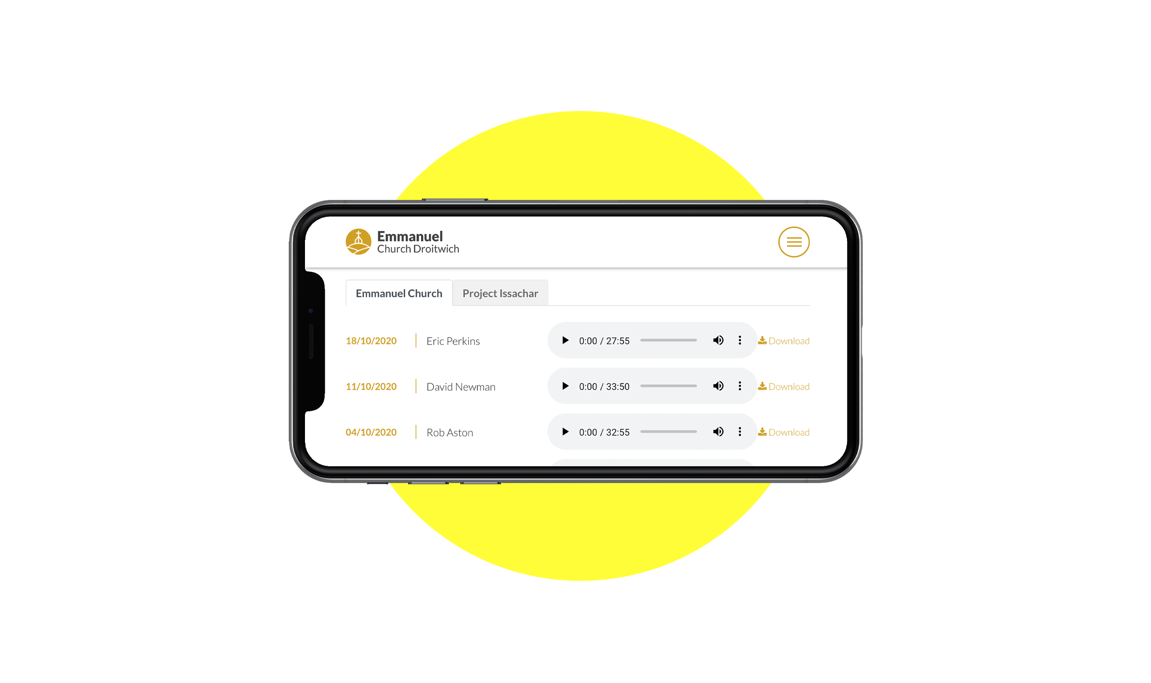
A website built to be maintained by a blind administrator
The site which we branded, designed and built for Emmanuel Church Droitwich, is updated every week with new texts, images and audio files, by an administrator who is blind and uses an e-reader. No surprise then that, some five years on, the site is still scoring just four negatives out of a potential 40 or so, via our preferred accessibility measure (The Guardian scored 5). But, when push comes to shove, few businesses can or will devote enough time and money into maintaining such high standard. Even amongst those that do, they tend to be oriented towards specific groups. A site which is highly accessible to the blind, can be anything but, to someone who is deaf. A website page which looks beautiful to someone with visual impairment, can be distressing to visitors with more extreme ADHD. So, even with genuine commitment to accessibility, there is a need to prioritise to whom you most want to be accessible. Who do you care about, most?
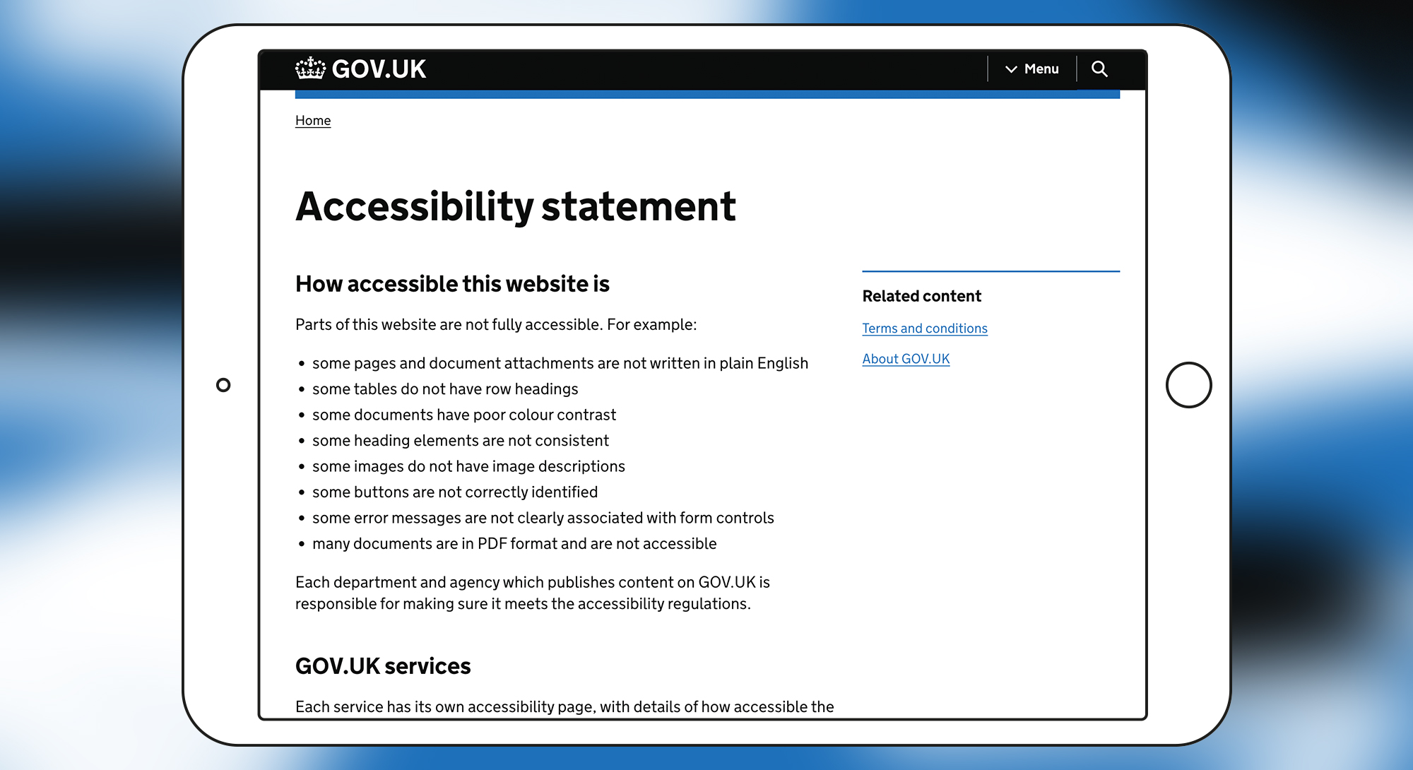
At first, clients can be a tad squeamish about having to choose, but the process is straightforward, so they soon relax. You just need to look at your target audiences and the challenges they face. How hard will it be to give them what they want? Bear in mind, too, that even the king of website accessibility, the Gov UK website, is not fully accessible, as it makes clear in its Accessibility Statement https://www.gov.uk/help/accessibility-statement .
Aren’t new technologies coming to the rescue?
To some extent, yes. E-readers are far better than they were and some website CMS packages will automatically create descriptions and other ‘hidden’ content. New software, such as voice-activated web browsing, is becoming more widely available at low or zero cost. And it’s true that browsers such as Chrome offer lots of brilliant accessibility tools, often free (see panel further below). However, just as a website aimed at a community with, say, lots of first language Gujarati speakers should not just leave them to rely on auto-translate software, the existence of such tools is no excuse for not looking after important visitors properly.
In this respect, as all others, it cannot be over-stressed that accessibility is a strategic decision and commitment which must be baked-in to your new website design from the start and maintained over time. Just as the need of a blind countess to write letters, led to the invention of the typewriter, when accessibility to a high standard is part of a website brief, it sparks real creativity and innovation, to the benefit of all.
Disabilities to consider and how their remedies help everyone
- Visual impairment and blindness; colour blindness
- Clearer, cleaner design, text that’s easier to read.
- Content that can be listened to whilst doing other things (e.g. the FT audio option).
- Hearing impairments
- Subtitles, transcripts of audio content.
- Motor impairments
- Websites that can be activated hands-free by voice, when working with your hands (e.g. cooking).
- Cognitive impairments
- Shorter, easier to read sentences; simpler language. Better, more logical navigation. Less ‘noisy’ design.
Some accessibility tools offered as Chrome extensions.
- Handsfree for Web – Voice Control – Browse the web using just your voice
- Read Aloud: A Text to Speech Voice Reader – Read aloud the current web-page article with one click, using text to speech (TTS). Supports 40+ languages.
- Magnifying Glass – The magnifying glass shows a zoomed image within its radius, without disturbing the rest of the page.
- Care your Eyes – Change the page background colour to the less intense or night mode.
- Noisli – Your digital place for focus. Listen to background sounds to mask annoying noises and help you focus while you work, study or relax.
- Screen Mask – A website and web document reading aid.
- BeeLine Reader – BeeLine helps people with dyslexia using a colour gradient that guides their eyes as they read.
- Helperbird– An ‘all in one extension’ primarily for dyslexics. Includes voice typing, dyslexia support, reading mode and more.
- Text mode for websites – Readbee – Simplified text mode/read mode for any article from the site without unnecessary things.
To find out more about what we do, call our MD, Michael on 01386 555666 or get in touch via the form here. Will will be pleased to hear from you.